5 Best Practices That Make an Award-Winning Non-Profit Website
novembro 17, 2022
In our world dominated by climate change doom and gloom, polarisation of our politics, and a faltering global economy, it can be hard for not-for-profit organizations to grab people’s attention. Although much of this may be beyond our immediate control, issue-based websites still remain the beating heart of setting out a clear narrative on why our clients’ issues matter.
At Purpose, we’ve worked with nonprofits that leverage websites to drive action, disseminate toolkits that enable policy shifts, and help facilitate difficult conversations around topics such as equity, and much more.
In light of our recent win at the Lovie Awards 2022, we wanted to share our best practices that helped our work with 5Rights Foundation win the award for Best Websites in the Charitable Organizations & Non-Profit Category. Check out the award-winning non-profit website here.
Without further ado, here are our 5 top tips for making an award-winning non-profit website.
- Make it navigable & actionable
It’s easy to get carried away by design trends or features that you have come across on other websites, but before you look into that, it is crucial that your website architecture and navigation are intuitive so that your core content and messages are easy to find. A poorly structured website will turn potential supporters away!
Having that architecture in place allows you to consider what you want your audience to do every step of the way. You might want them to take different actions depending on the section of your website they are in – including making a donation, watching a video, downloading a toolkit, or signing a petition. Make sure every page has a clear call to action.
With 5Rights, our mission was to drive engagement (and ultimately downloads) of the amazing toolkit that would help policymakers across the world create the right conditions to build a safe online world for children. This was at the top of our minds when designing the Child Online Safety Toolkit website, with constant and clear moments to engage with the toolkit on every page and with nearly every scroll.
- How to tell your story
When visiting a non-profit website, the user wants to know why they are here and how they can benefit from engaging. Keeping this in mind forces you to tell your story and tell it clearly. What can help is using visuals and cues to cut through the noise and get to the point. Below are some quick tips that helped make childonlinesafetytoolkit.org a success:
Be consistent: The use of a consistent, bold, and unique visual style and language allowed us to build a visual universe around the Child Online Safety Toolkit that was used across all external communications. This consistency engenders a sense of familiarity and allows the user to focus on the message you are trying to communicate.
Be emotional: Use photography, quotes and stories that are authentic. They will be more emotional, more powerful, and will strike a chord with your audience.
Be strict: Don’t be afraid to use white space, instead of overloading the user with content; this white space draws the eye to your message and makes the user digest it with ease. - Optimize for accessibility and a smooth mobile experience
While accessibility and inclusivity are at the heart of every NGOs’ operations and mission statement, it isn’t always reflected in their online presence. This was so important for the 5Rights project; we needed to create a visually engaging, iterative and informative website that could be accessed easily from places with lower bandwidth and download speeds.
Ensuring the website was mobile-first was also a key design and user-experience consideration, given the wide geographical span this website would cover. We designed it with the understanding that many of those accessing the non-profit website would be doing it via mobile device, something that moving forward all NGOs must do.
- Stay true to who you are and what you do
It is vital that you stay true to your organization or brand principles when designing and building your website, even if it is an offshoot of your main site. You must remind your audiences why you are here and why the world needs you to exist. This will allow you to highlight the impact you’re having on the world and drive your audiences to participate.
With the Child Online Safety Toolkit, we wanted to maintain clarity of message and a clean visual style as key elements that would push the user to the toolkit, and the desired impact implementation of the toolkit will have: a safe online world for children. - Keep your content fresh
We have already established the need for sharing your impact. However, sharing impact is an ongoing process and your website should reflect that! This could be in the form of articles, blog posts, research findings or simply updating the partners involved with your work. Doing this will help validate your efforts with existing stakeholders and help continue to build your credibility with new supporters. As a bonus, fresh content also helps with SEO (Search Engine Optimization) – which will help you rank higher on web searches and make your non-profit website, and ultimately your NGO, more discoverable!
When building your website, be crystal clear on what you want the user to do, and how you guide them through their digital experience. This is the bedrock for making an award-winning website and allows you to build a visually engaging, and ultimately impactful product, something that we were able to do in collaboration with the brilliant 5Rights.

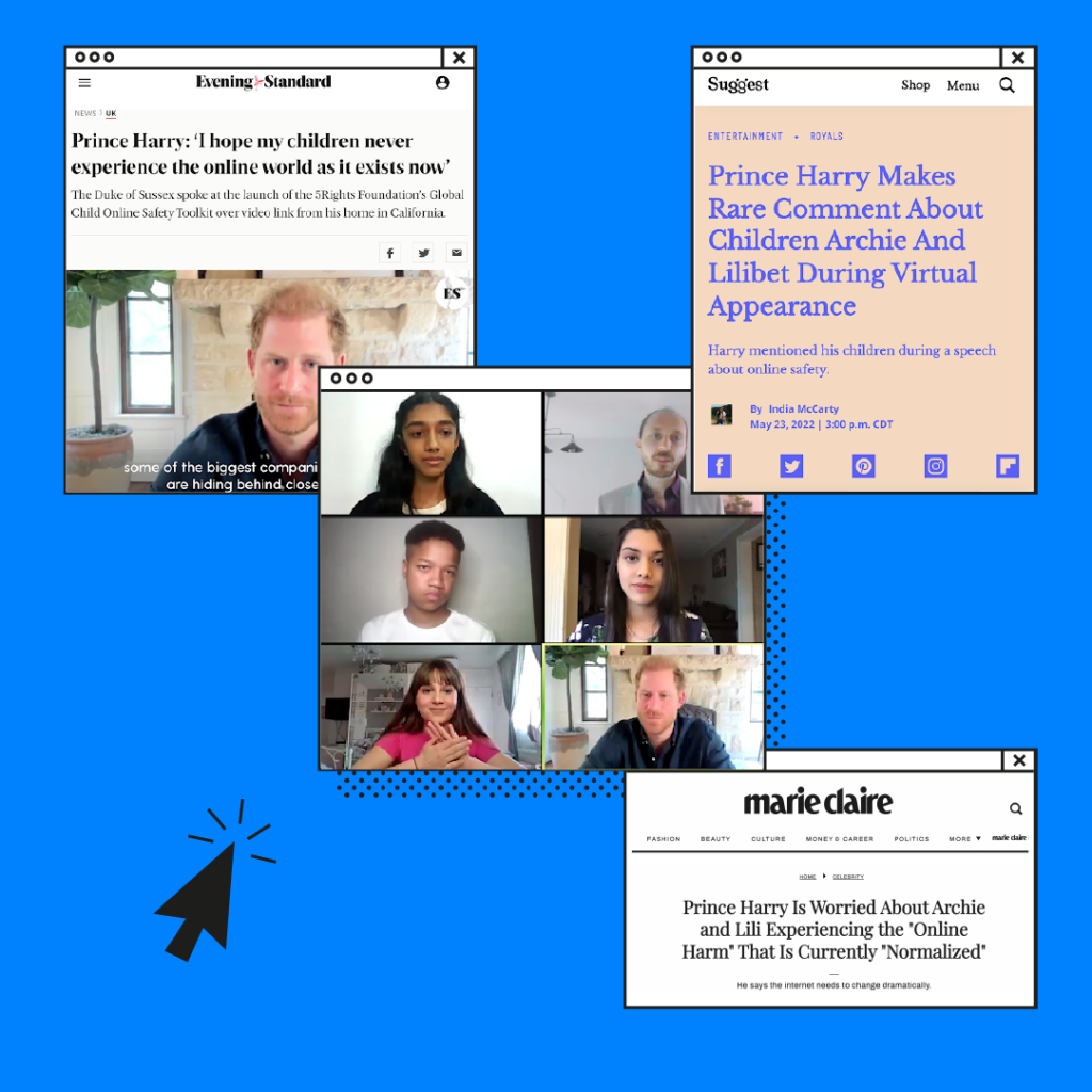
With a well-thought-out, intentional design, your website will be a great foundation and hub for driving action and results – as we saw with the press & our launch event with Harry, Duke of Sussex, attending in support of making child online safety a reality.”
Um guia digital de combate à desinformação.